Unique & Professional Book Design to Make Your Vision Come Alive
Cover Portfolio
In this portfolio, you will see custom designs created for various authors of non-fiction and fiction in several genres. The genre of each should be understood just by looking.
Custom Design is by far the best choice for cover design and interior formatting. It gives the author the ability to share the vision they have for their book and gives us the chance to turn that dream into a professional, unique book that works well for the specific genre.
Click on an image to open a larger slideshow view of the designs
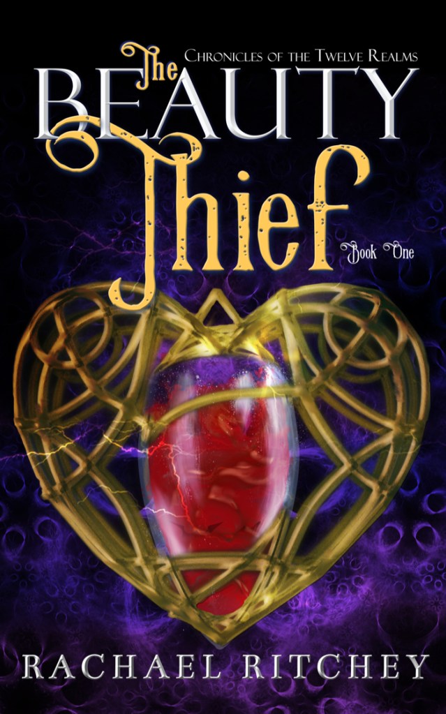
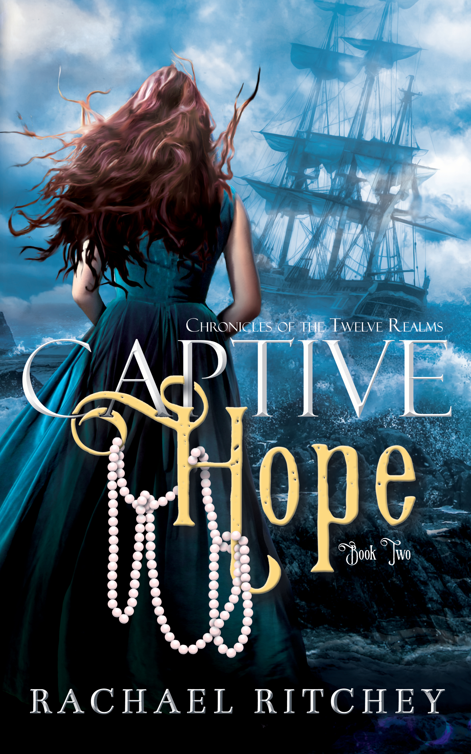
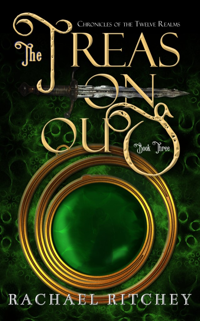
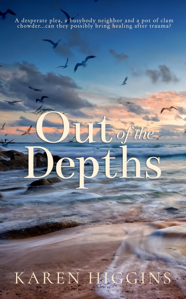
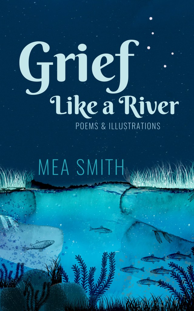
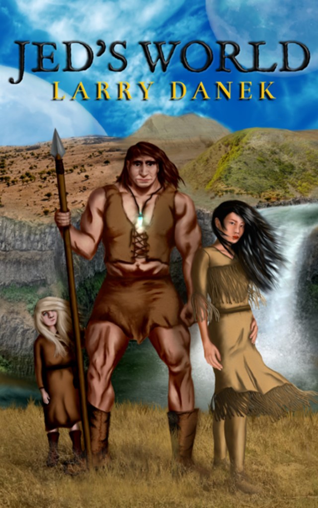
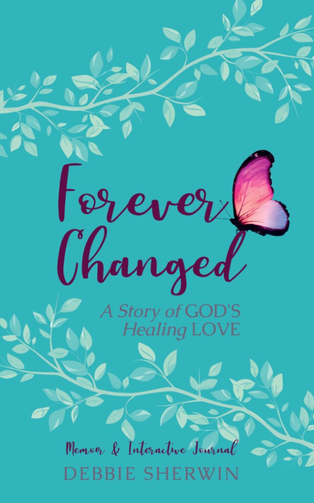
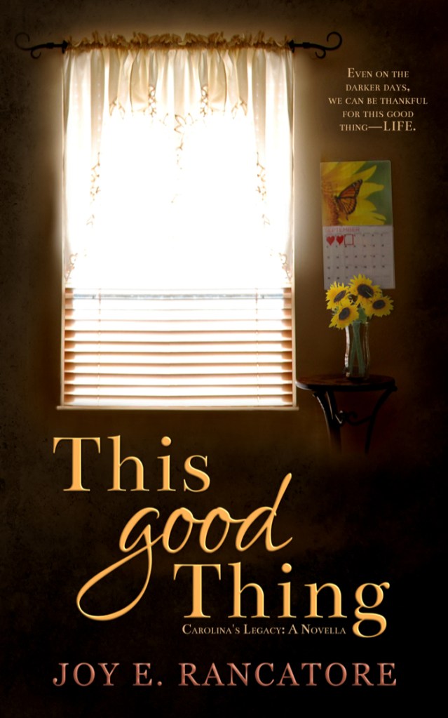
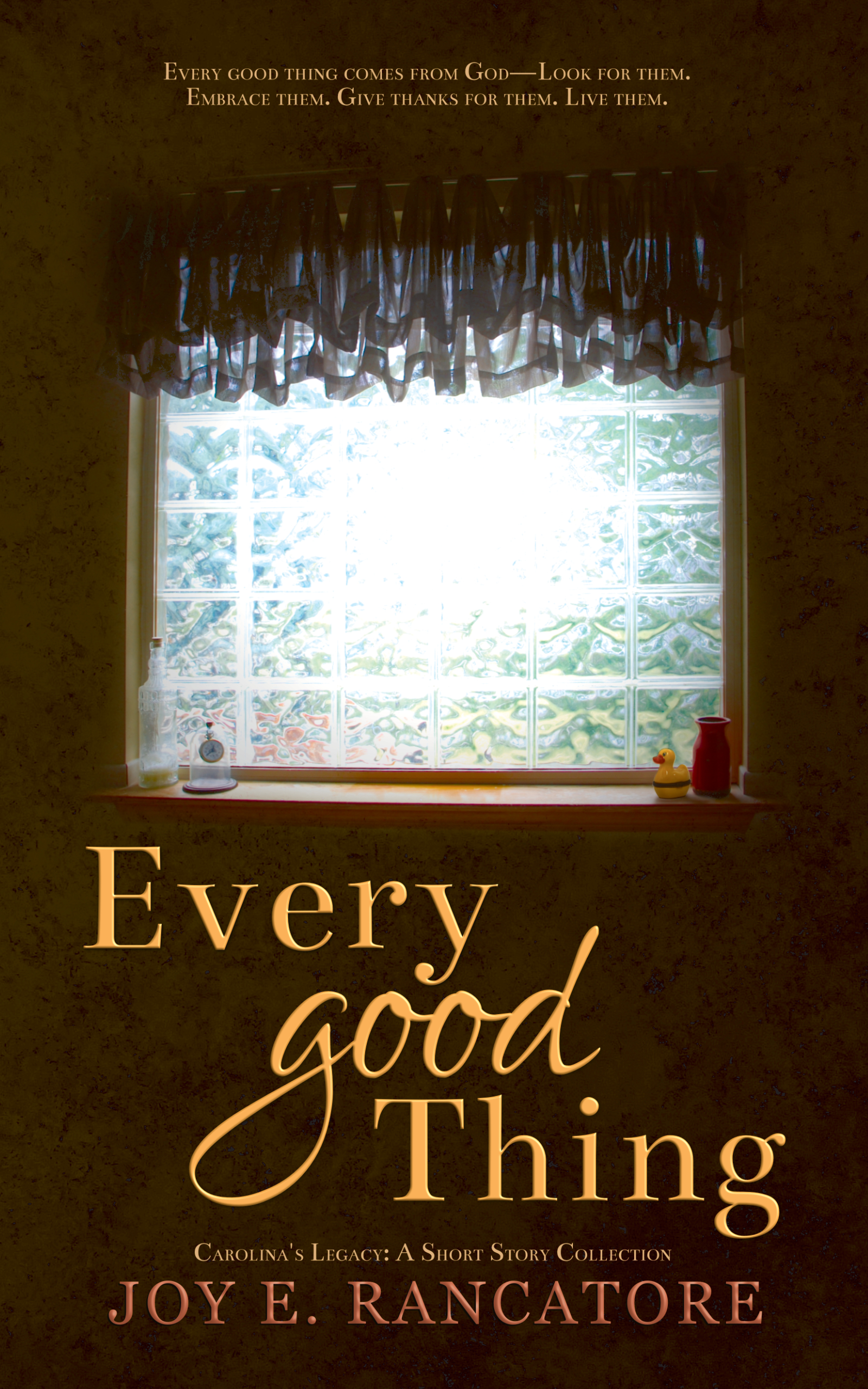
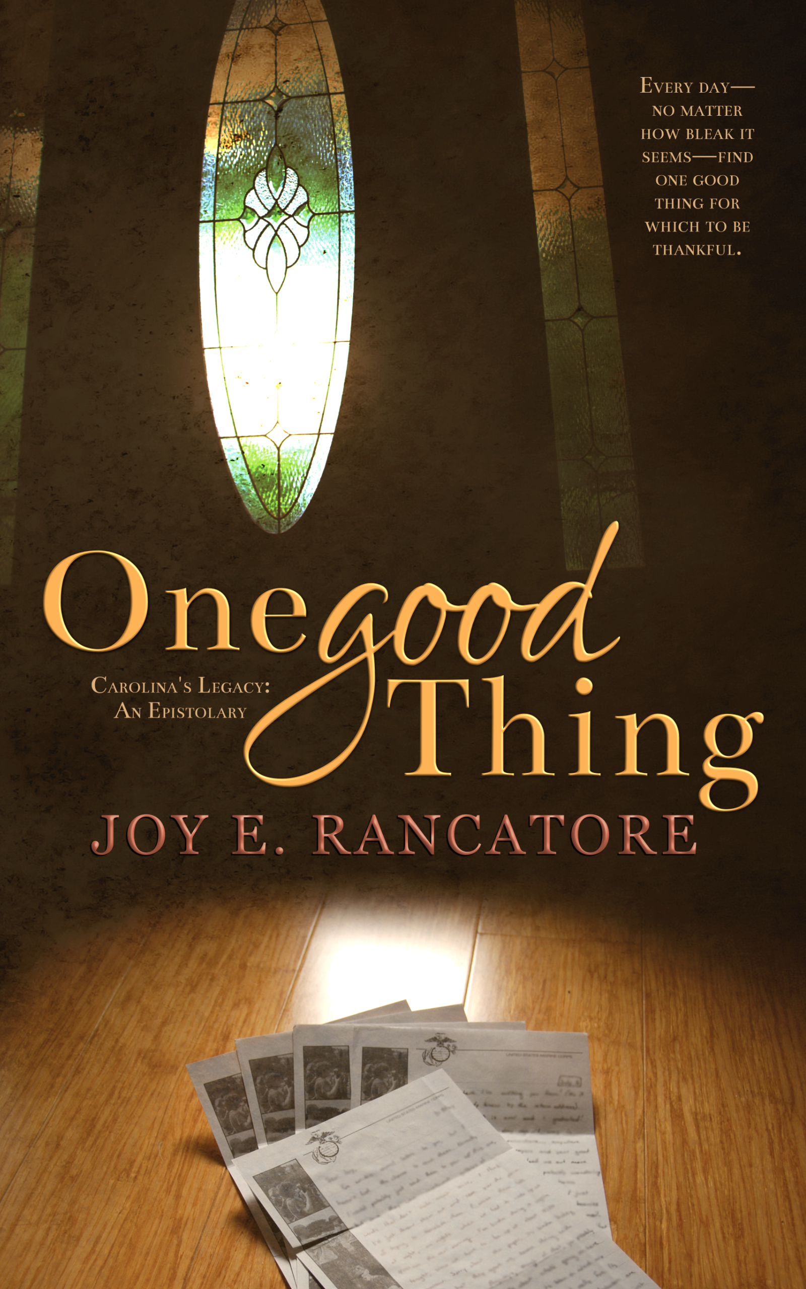
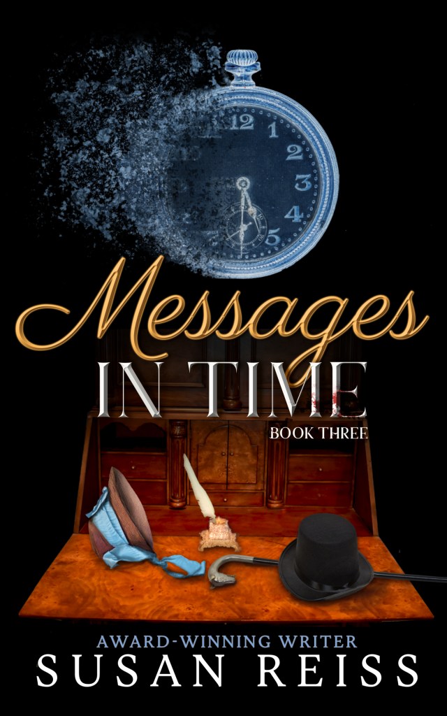
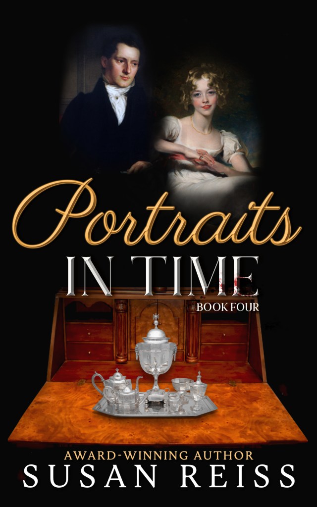
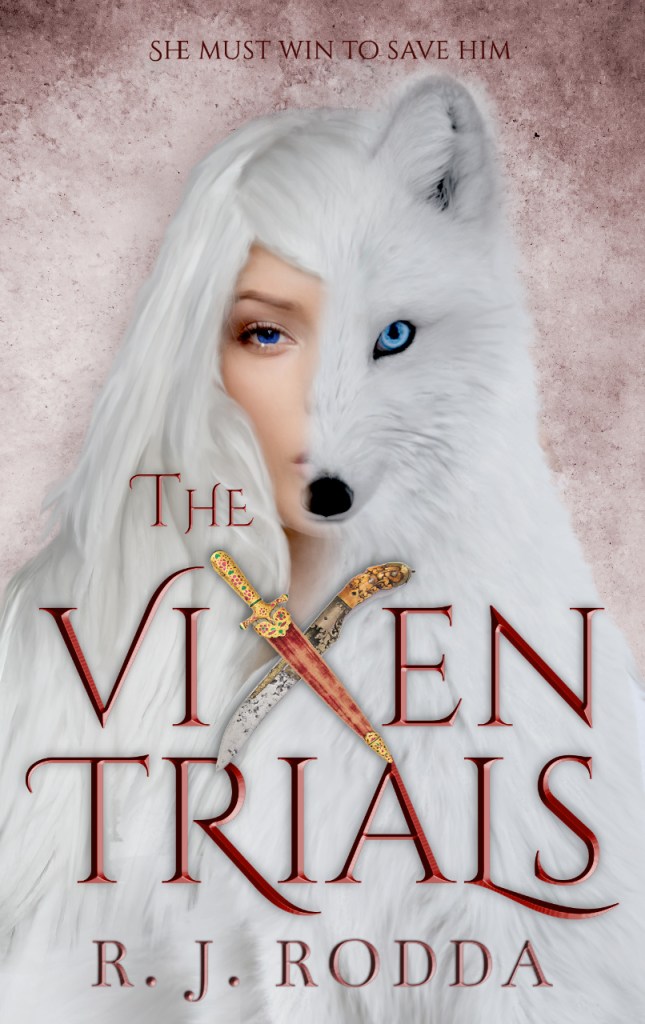
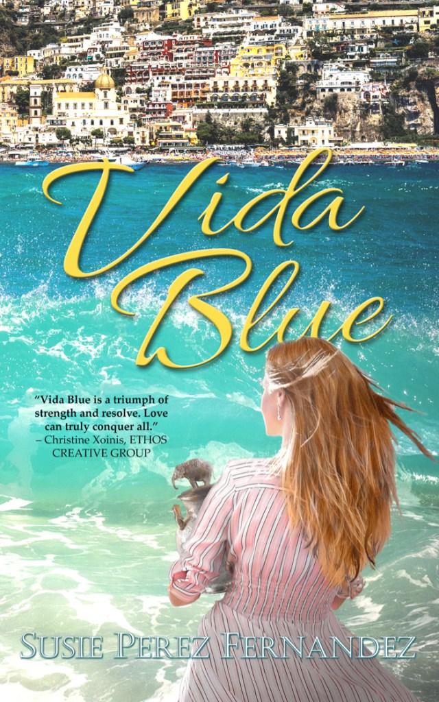
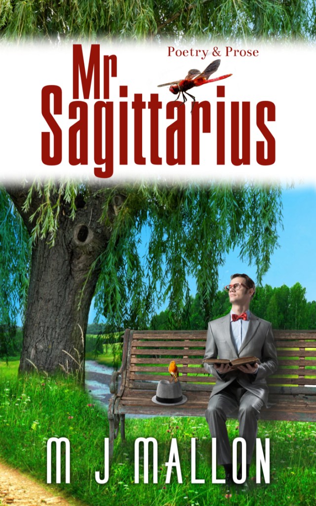
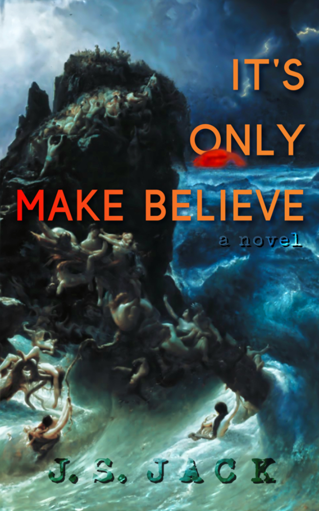
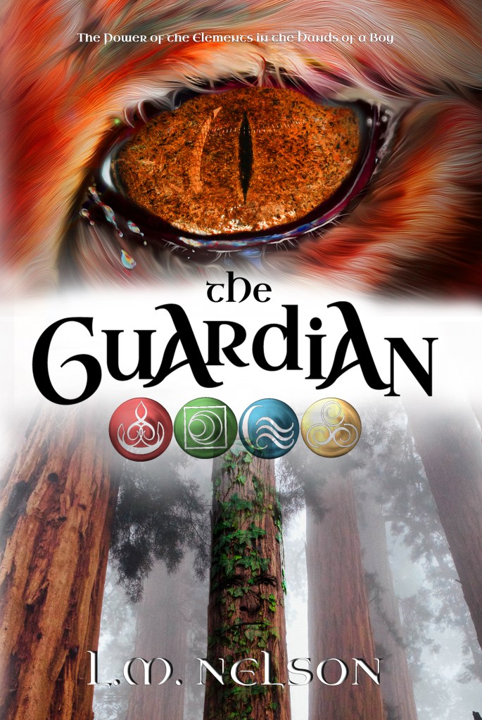
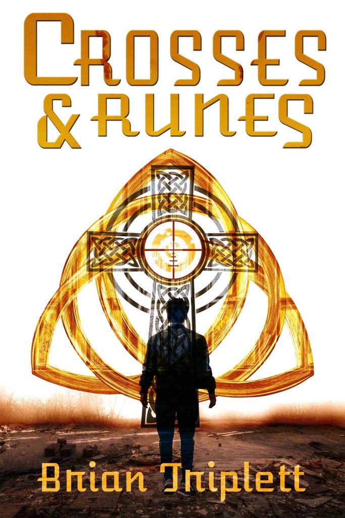
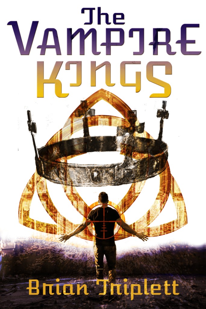
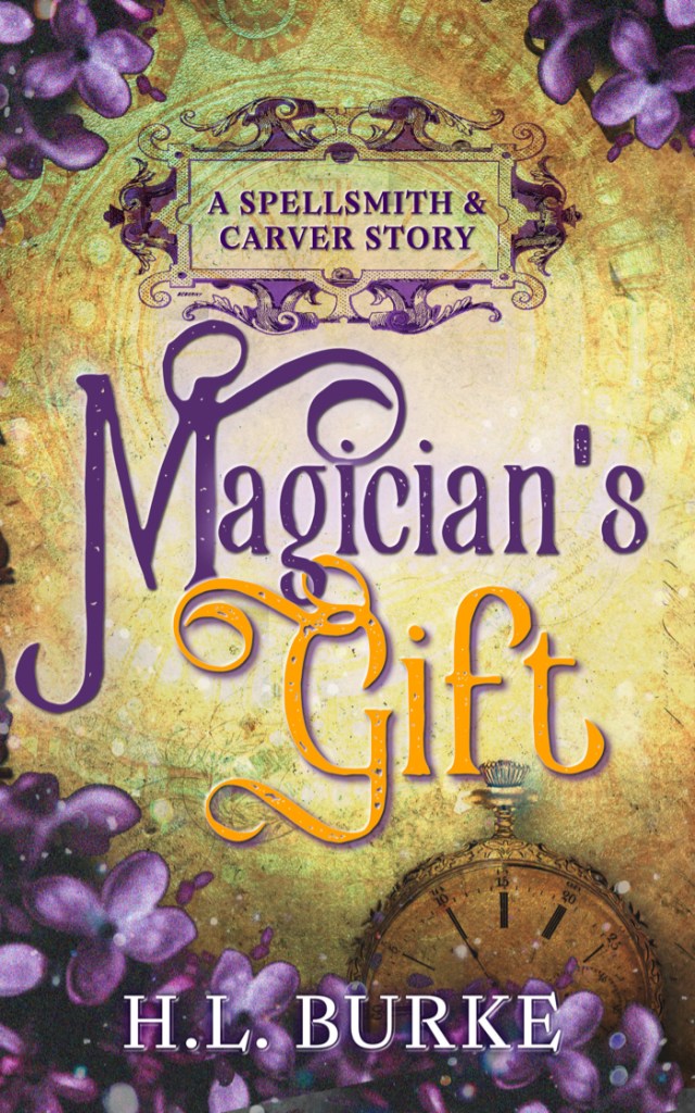
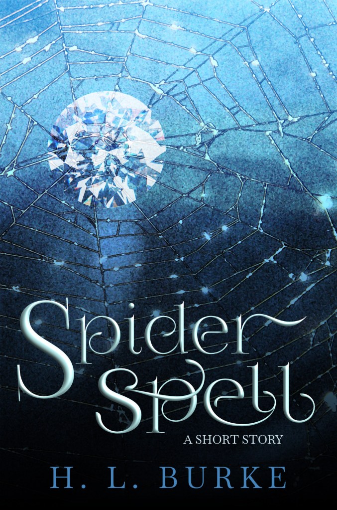
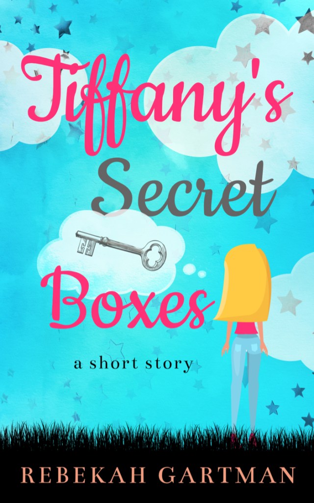
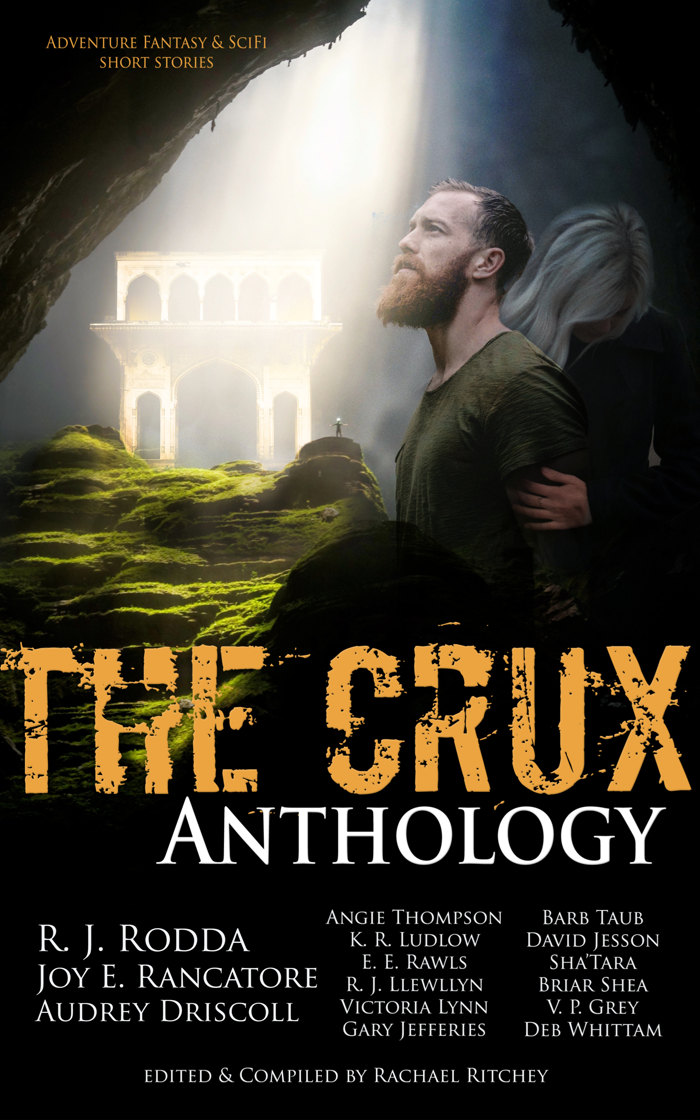
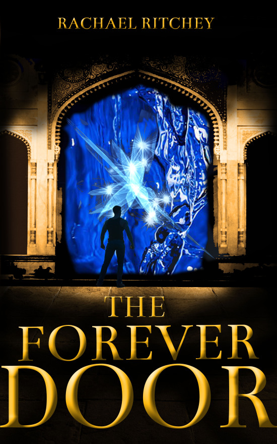
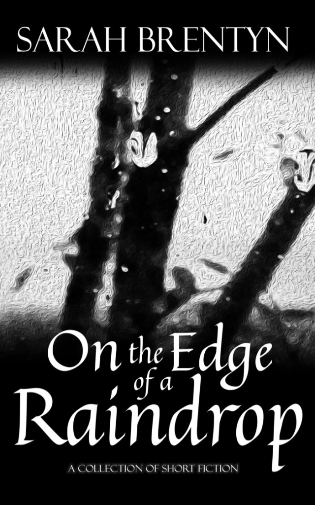
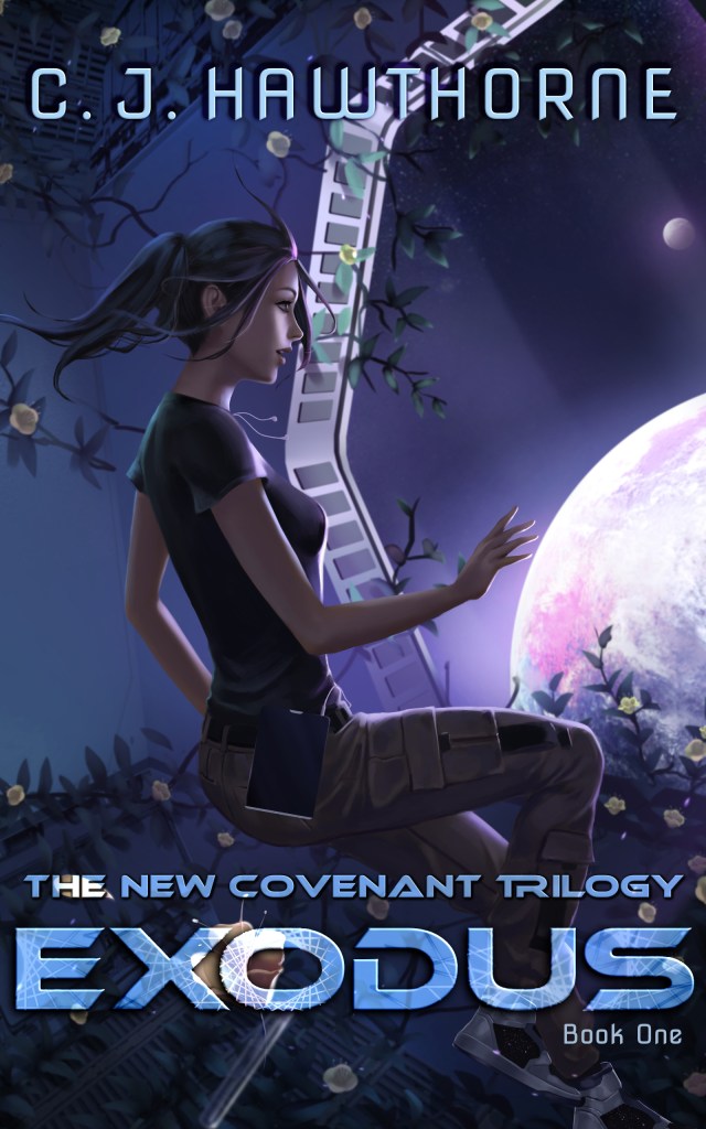
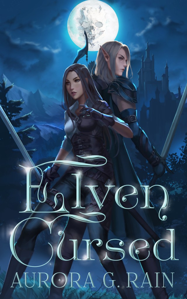
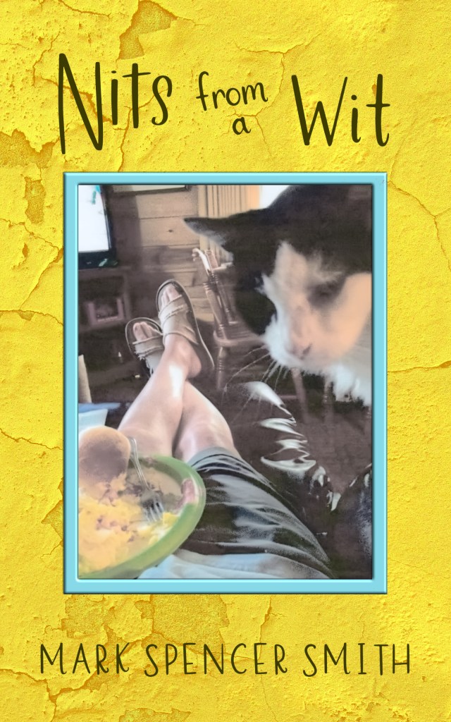
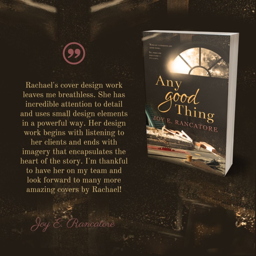
The Beauty Thief is book one of The Chronicles of the Twelve Realms series by Rachael Ritchey. This is the latest renditon of the cover with elements that tie together with the other books in the series. The amulet is representative of a key element in the plot of the book and was created in whole in Affinity Photo by Rachael.This is book two in Chronicles of the Twelve Realms by Rachael Ritchey. The title treatment is indicitive of the series with similar elements of jewelry that carries across the main series covers. This is an updated version of a previously published book. We started from scratch on this design, but I’m so happy with how the various elements came together on this non-fiction autobiographical memoir and it’s corresponding interior formatting.While the background of this science fiction fantasy novel is compiled using photographs in Affinity Photo, the characters are my own artwork comissioned by the author. The entire cover design front and back is my work.The main images used to create this cover were taken by the author. I used Affinity photo to merge images into a cohesive design, and more in the series will have the same elemens of style and color scheme. A favorite element we added was the subtle sawdust floating in the air.This Good Thing is a companion novella to Any Good Thing by Joy E. Rancatore. Our goal is to create a similar mood and warmth across all book in this series. Joy and I are keeping certain elements of light through windows, dark brown background and simlar text title treatment acorss the series.R J Rodda has not yet published this book, but she was the winner of a cover design from Rachael Ritchey’s The Crux Anthology short story contest. This book is currently available to read for free on Wattpad.Pastor Just Benjamin Stodghill obtained permission from Westminster Abbey to use photos of their propery on the cover of this doctrinale treatise. The entire cover is as beautiful and dramatic for this non-fiction dissertation as it appears here.Vida Blue was another fun project that took several different elements to come together to create this beautiful cover.This book hasn’t yet been completed or released, but it is a second book I am working on with the author. You can see how we have tied the books together with slight elements of vibrant color and font/typsetting choices.This book of poetry and prose is a seamless and adventurous walk through the difficulties of life. The cover captures the whimsy of the interior where the stories are highlighted by photos taken by the author.J. S. Jack provided the image for this cover. It is a Public Domain painting. I added the title treatment.L. M. Nelson wanted to create something special that could tie the cover and interior of this design together, so I hand drew and then digitally enhanced the fire, earth, water, and air elements you see below the title. Because this is MG fantasy fiction, we were happy with the font choice that contrasts well with the earthy images.This cover gives us a clear idea of the action and possibly religious aspects of this SFF novel by Brian Triplett.The series by this author is still in proces, but the first two books really highlight the eyecatching fantasy/science fiction design that has certain elements that tie it all together.This is the e-book version of this book which is actually a beautiful square book. All the interior illustrations and the flowers on the front are Rachael’s artwork (pencil drawings converted to digital art). We went through several cover ideas, but this was definitely the best cover design to highlight the idea of being a winner. The colors and style fit perfectly in the non-fiction self-help genre.This is a companion novella to a series by H. L. Burke, but it doesn’t follow the pattern of the series itself. The subtitle (A Spellsmith & Carver Story) and the author’s name are what tie it in with the fantastic series design created by a different cover designer.This is a short story by H. L. Burke that I had a nearly perfect premade cover for. As you can see, all we needed to do was update the author name, subtitle (A Short Story) and the title. Because I like to make sure the title treatment is appropriate to the title, I always leave font style open to whatever is needed to create the right atmosphere for the cover.This short story is a sweet little book that I particularly enjoyed because the book is one of many written by my mother-in-law and the first one she’s officially published. This is for late elementary and MG girls.This is a magazine-style book. The inside formatting is detailed and vibrant, full of a gorgeous use of the author’s personal photos and columned text. The outside features the author in her element. A biographical memoir about the author’s brother. The Crux Anthology is the culmination of sixteen authors hard work to create a book of fantasy and science fiction short stories with the intent of giving all profits from the sale of the book to Compassion International. This is the first book in a MG series by a young author. This is book two in a series by young author Anthony G. Asher. In real life, he is a trapper, and he loves dogs. The series covers capture the bright, light-hearted adventure and mystery in this MG series.More sharp, witty, thought-provoking short fiction with a cover design based mainly upon an photo taken by the author.
Below are books with pre-existing, and author-templated images where I’ve added the text/type-setting formatting and sometimes extra elements to enhance the overall design.
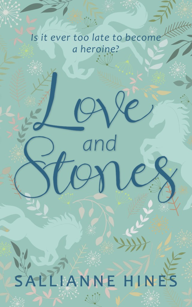
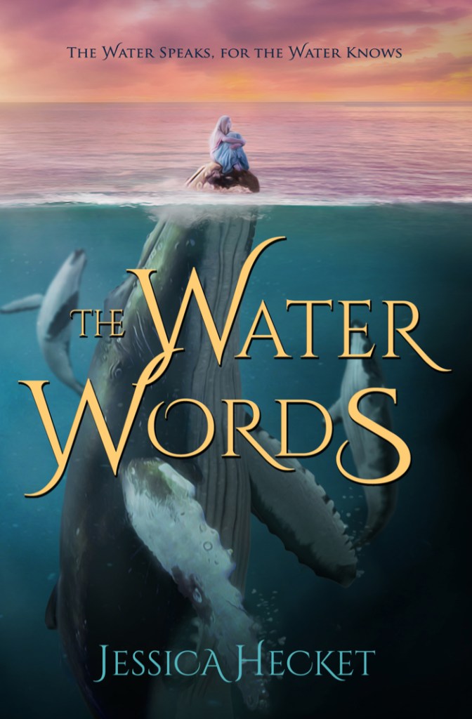
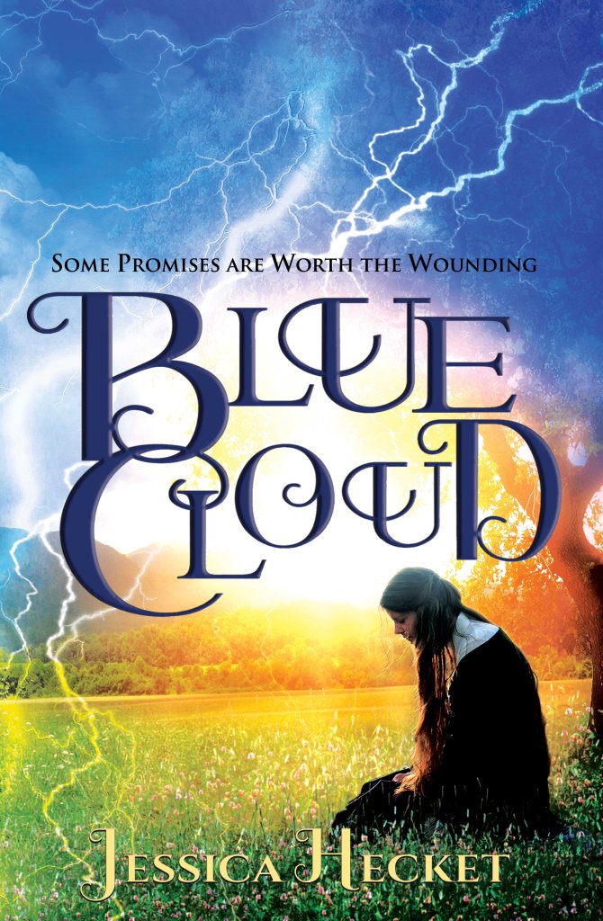
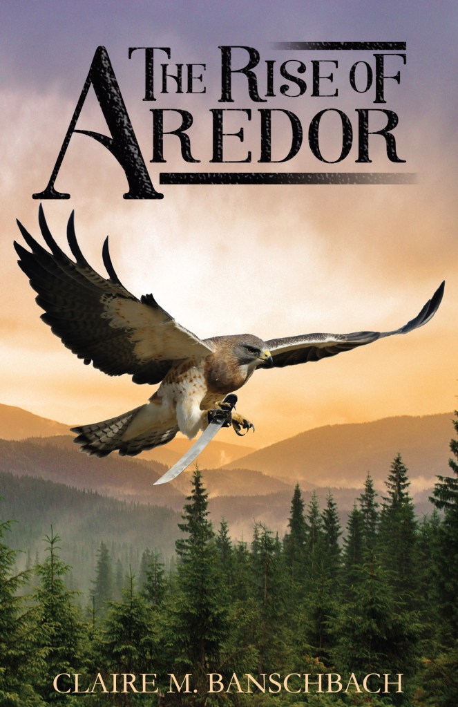
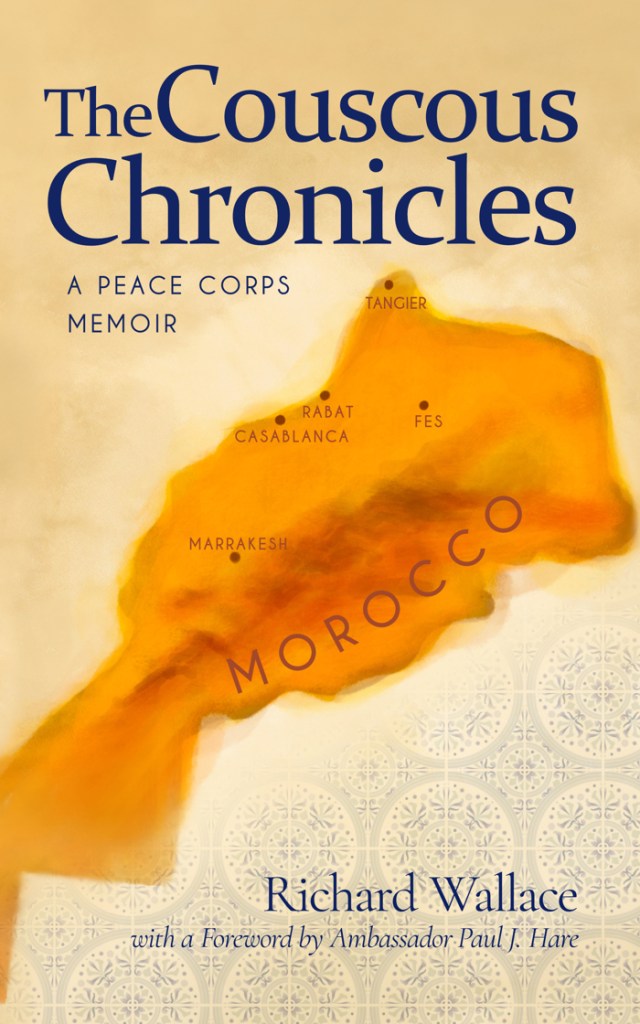
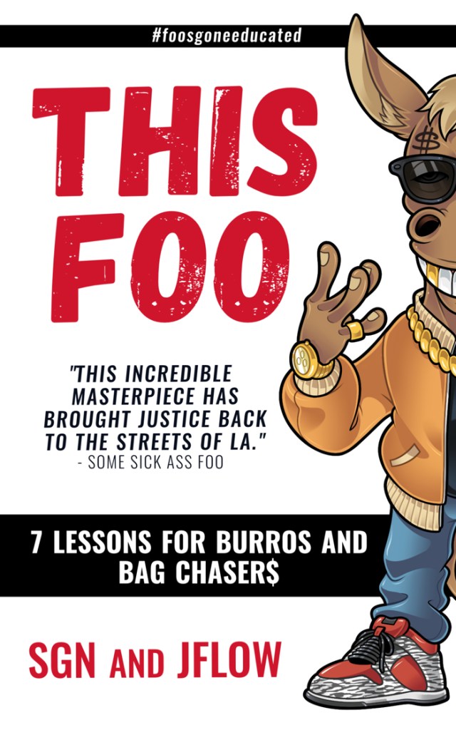
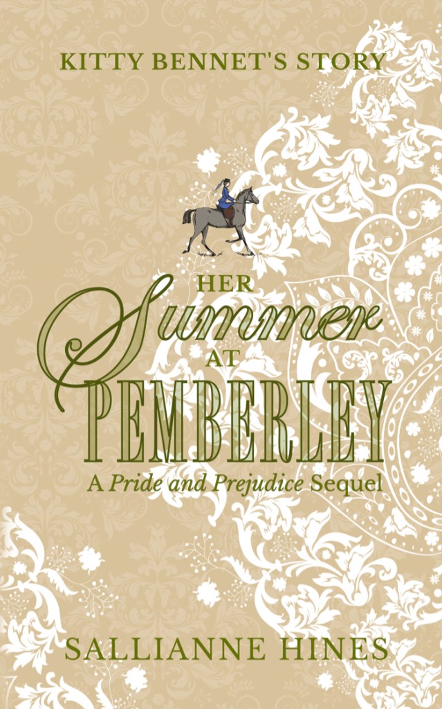
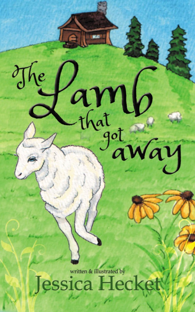
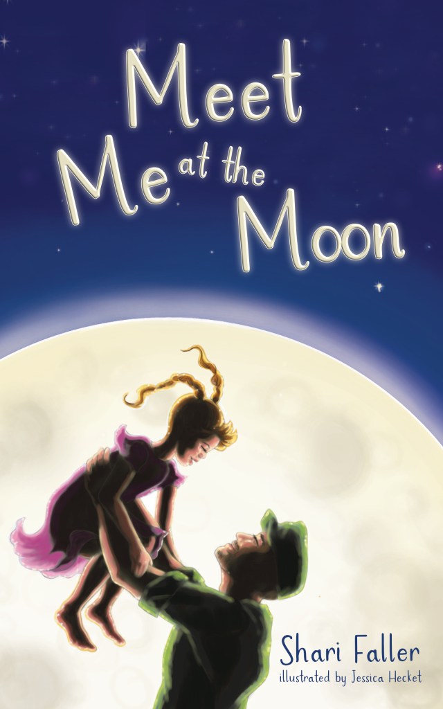
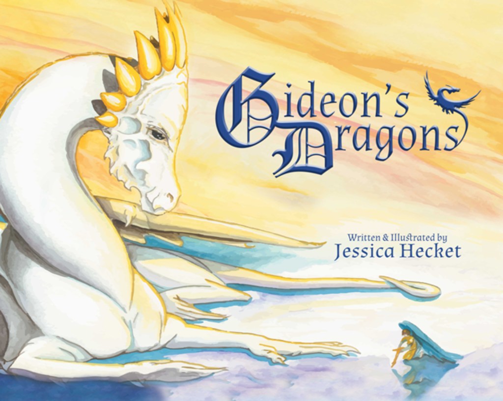
This is a YA fantasy fiction novel by Jessica Hecket with some pencil and watercolor illustrations inside by the author. The cover image was created by another graphic artist, and I did the final title treatment, spine and back cover text.Blue Cloud was a fun cover to work on the design. The author is actually pictured as the character on the cover (front and back). She and another graphic designer/photographer got together to create the main image background. I added the brightening and dramatic elements and title treatment. The paperback of this book is beautiful!When Claire got her covers back from her previous publisher, she wanted to updated the text to match her second book in this duology. That is all I have added to this cover design.While the main design of this is artwork by another person, I did adapt some elements to carry through onto the back as well as adding to the map to display more desert area. I also did the title treatment. Originally, it was smaller, but it was agreed that increasing the size not only made it more legible but added more balance to the design. This is a non-fiction memoir of Richard Wallace’s time in the Peace Corps.The authors of This Foo provided the graphic burro elements of this cover and also the over style they were going for. I was able to take their ideas and help turn this cover into a beautiful seamless design front to back. The interior design has elements that mirror the cover.Sallianne Hines creates her own cover template and sends me the design as she wants it created. I take the needed elements and recreate title and other elements as close to her template as possible and then create the rest of the cover’s spine and back.This is a second edition of Shirley’s book. We redid the formatting and updated the cover with an image she really wanted to have, highlighting this community.To create this cover, we used Affinity Photo to take elements from various illustrations by Jessica Hecket (the author) to create a cohesive design to reflect the style of the inside of the book.The artwork on this fairytale illustrated children’s book cover is created by Jessica Hecket. Gold and Red edge elements were added by Rachael along with the text treatment.The illustration of this cover is primarily the work fo the author, Jessica Hecket. There was too much white space that didn’t balance well to highlight the dragon, so with Jessica’s permission, I added more of the background color element across the cover to encourage the eye to focus on the dragon and the title elements.
Too see the cover and interiors of books I’ve designed in combination head over to the: